
Friendernaut
Case Study
Making new friends as an adult has never been easier. With events catering to the user’s needs and wants, attending them has resulted in making precious connections with people. The Friendernaut app is to thank for.
About the Case Study
-
By giving adults the opportunity to attend events that cater to their interests and needs, Friendernaut is an app that helps people make new connections through the social gatherings they chose.
-
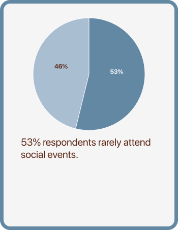
Friendernaut was developed to help adults connect to one another through social gathering events. However, the number of people who sign up for events and actually attend them is only 20%.
-
To ensure that users follow through in attending the events they sign up for, I introduced the feature of being able to add their events to their device either in their Apple wallet or in their camera roll. In addition, I believe giving the users the options in narrowing down the types of events they want to go to, will increase attendance since it matches a variety of their needs. Thus, motivating them to attend.

Design Process
-
Stage 1: Empathy
User Interviews & Surveys
Persona Maps
-
Stage 2: Design
User Flows
Lo-fi Wireframes
-
Stage 3: Validate
Usability Testing (2 rounds)
-
Stage 4: Prototype
Hi-fi Wireframes
Usability Testing
Final Screens
Stage 1: Empathy
User Interviews & Surveys
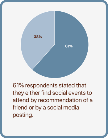
Friendernaut was seeing that only 20% of their users would attend for an event they signed up for. Meaning 80% of users were not attending them. It was my job to figure out why this is the case. In order to do so, I sent out an online questionnaire to help me come up with hypotheses. I saw some interesting responses out of the 13 participants. Turns out, with all that comes with being an adult, making connections and attending social events have their own set of unique challenges.


User Persona Maps
With the responses from my user interviews, I was able to find some underlying themes. With these themes, I created two persona maps that I think is diverse enough to cover the thoughts and feelings my participants have.


Stage 2: Design
User Flows
Now that I have an idea as to why users were not attending the events they were signing up for, I had a few design solutions in mind. I wanted to include in my user flows a way for users to filter events and for users to save the event to their phones.

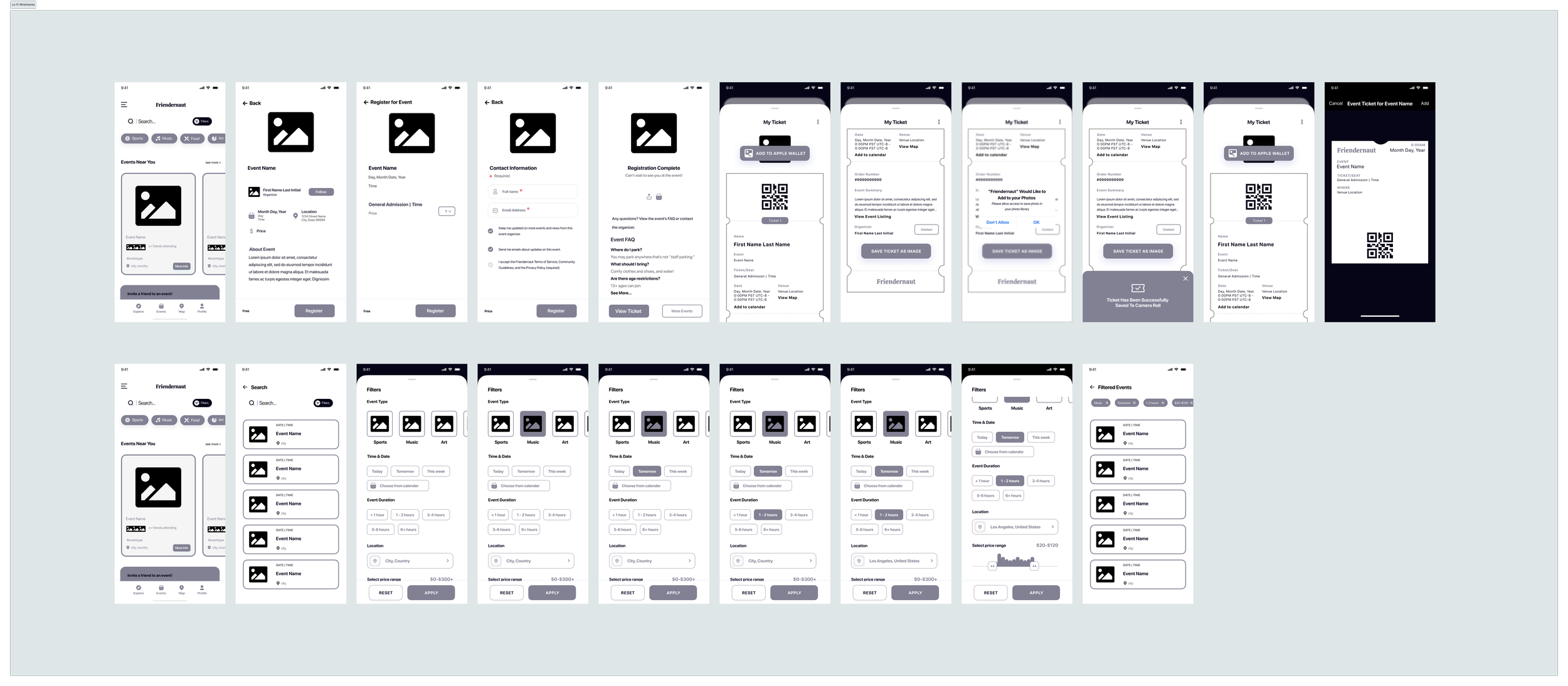
Lo-Fi Wireframes
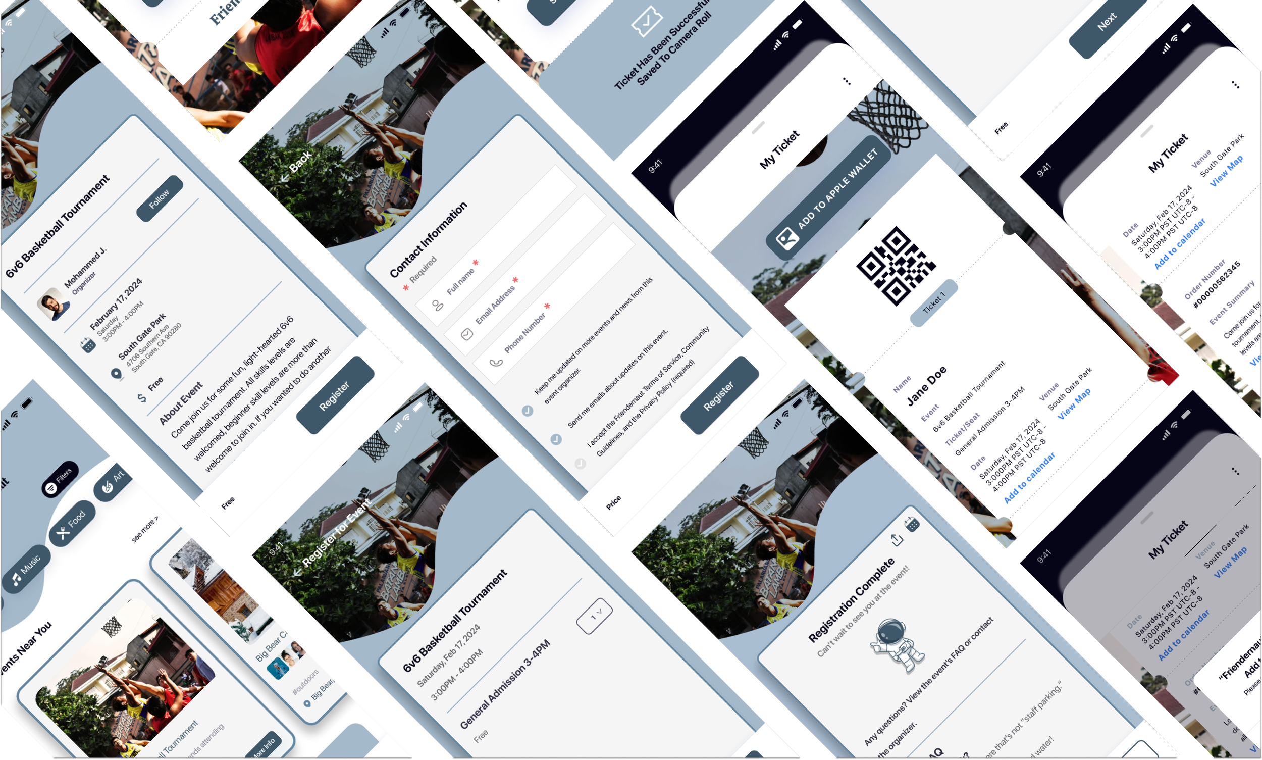
With a solid plan as to how users will navigate through the app with my two new features, I can draw out my lo-fi wireframes. These wireframes show two routes:
How to register for an event and save the event to your phone’s wallet or camera roll.
How to filter through events to find ones that work with your schedule, budget, and interests
Stage 3: Validate
Usability Testing
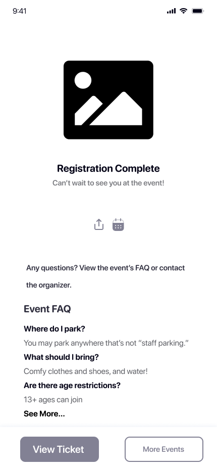
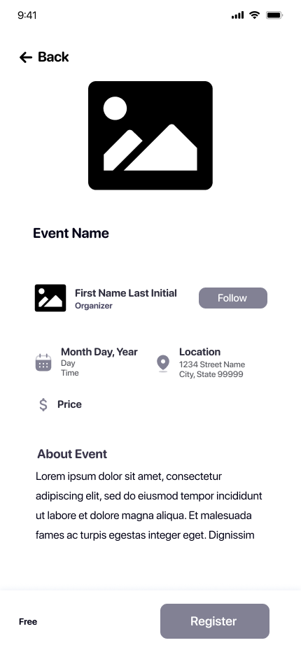
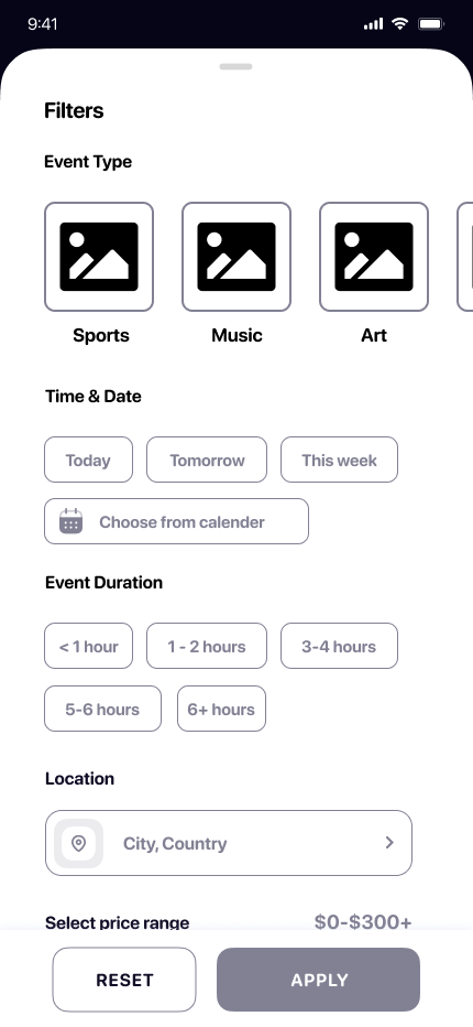
With a tangible product to work with, I can put it to test to see how users navigate through the app, their thoughts and actions, and whether or not they can complete these tasks:
View an event and register to attend one.
Save the event to your phone’s camera roll and Apple wallet.
Search for an event by using filters.
Apply the following filters:
Music
Tomorrow
1-2 hours
Overall, users found the app relatively easy and straight-forward to use. They found the UI design to be clean and free of excessive features. However, some features were noted to me that should be taken into consideration when revising in terms of the events themselves.
Strengths
UI design = simple yet aesthetically pleasing
Intuitive
Buttons were clear and not confusing
Natural flow for registering for an event
Improvements
Increase font sizes
Stronger visual hierarchy for headings and subheadings
Include a note that let’s users know about their friends event recommendations
Priorities
Visual hierarchy
Color palette
Friend’s recommendation
Stage 4: Prototype
Hi-fi Wireframes
After reviewing the results from my usability testing, I moved forward with revisions and edits and made the following hi-fi wireframes:


Second Round of Usability Testing
With these hi-fi wireframes, I put them to test for a second time to see if the edits and revisions I made were effective.
Overall the users seemed to really like the colors and the UI design of the finalized product. They said that it was simple and clean, but still welcoming and aesthetically pleasing to use. The participants were able to perform the tasks with ease.
Edits
Organic shape on the tops of the screens
Name of event first then the date and time on the bottom for visual hierarchy
Adjusted font weights and sizes for a more cohesive look
Findings
Users had a significantly easier time navigating
Noticed the event name first then the date and time
Text on event ticket was more readable
Wanted to save the event to their apple wallet
Suggestions
Screens for information regarding pre-event tasks or notices, during the event and post-event
Creating screens that gives tips to users who struggle with social anxiety
Enable users to post photos of the event live
Reward “punch” card to increase user attendance
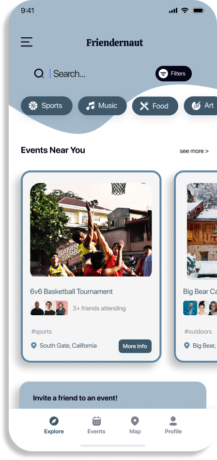
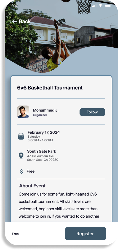
Final Screens & Reflection
Finally, after doing some user research, analyzing the data, designing lo-fi wireframes, testing them, making revisions and edits, and testing them again, I created the final screens for Friendernaut.
I’ve come to find an easier way of designing apps by using UI element kits and having a clearer vision of what flows I wanted to design. Additionally, I have grown fond of the user research portion of the design process in that it is the foundation for what comes next. Really understanding or attempting to understand the users pain points and frustrations is interesting and influential for the designs. I plan on adding more screens with the suggestions I found with my second round of testing later in the future.
